Theme Settings
Once your theme is purchased and properly installed, the first step to go through before doing anything else is to start customizing your theme for your company.
The Nucleon Theme offers a lot of customization options, so we recommend not to skip this part! It will give you a solid foundation before creating your website pages.
In order to do this, go to your HubSpot portal settings and navigate to Settings > Website > Themes. Choose the Nucleon Theme. We’ll then help you navigate through all the options.
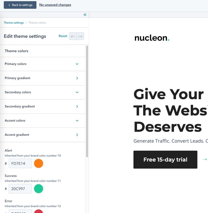
Theme Colors
Customize your brand colors with the different options below.
By configuring all these color variants, you'll then be able to access a large color palette in the styles options of your modules.
Primary Colors
| Primary Colors |
This color is the key color of your website, like the Emerald Green for Nucleon. Choose the one you want as the Base color. Then you can set the different shades of this color with a darker and a lighter value. These shades will be used when hovering a button for example. |
| Primary Gradient |
You can configure a primary gradient based on your primary color. You'll be able to use it if you prefer using a gradient instead of a solid color anywhere on your website. To do so, choose the start color and the end color of your gradient (we recommend to use the primary color for one of the two options to keep consistency in your design). |
Secondary Colors
| Secondary Colors |
The secondary color is the color that you'll be using in your website for some backgrounds for instance, or buttons, or elements you'd like to be more "discret" in your design. Like the Light Grey Color in Nucleon. Once again here, you can set the different shades of this color with a darker and a lighter value. |
| Secondary Gradient |
You can configure a secondary gradient based on your secondary color. You'll be able to use it if you prefer using a gradient instead of a solid color anywhere on your website. To do so, choose the start color and the end color of your gradient (we recommend to use the secondary color for one of the two options to keep consistency in your design). |
Accent Colors
| Accent Colors / Accent Gradient |
The accent color is not used by default in the theme, but it allows you to enlarge your custom palette within your website. You can use it the same way you did it with the primary and secondary colors, by configuring different shades and gradients. |
Specific colors
| Alert |
The alert color is used in forms to display alert messages. |
| Success |
The success color is used in forms validation process. |
| Error |
The error color is used in forms to display error messages. |
Specific colors
| Black |
The black color is the darkest color you want to use in your website. |
| Gray |
The gray color is a medium color you'd like t use as an intermediate color between black and white (...cleverest definition ever ^^) |
| Light |
The light color is the lightest color you'd like to use in your website. |
Theme Fonts
This is where you'll be able to define the main fonts you'll be using in your website, like the body font and the headings font.
The fonts available are divided into two types:
- Common fonts: these are web safe fonts that are used by default in all the current existing browsers.
- Google Fonts: the Google Fonts are external fonts provided by Google. They are loaded into your website with an external script, so be aware that using these fonts can somehow impact your page speed.
Note that you'll have the ability to select fonts specifically for the different types of content (headings, paragraphs, links, etc) in the next section, the Text tab.
Text
This is where you can adjust the fonts for all your text items, including:
- Headings
- Paragraphs
- Links
- Blockquotes
- Lists
Headings
You can customize your heading styles regarding the level of hierarchy by adjusting several options:
- Text font
- Text color
- Text transform
- Margins around the heading item
Paragraphs
You can customize your paragraphs styles following the type of the paragraphs: Classic paragraphs, Lead Paragraphs, Small Paragraphs.
Links
You can customize your links styles with two options: fonts and links colors.
Blockquotes
You can customize your blockquotes styles with several options: font size, color and spacing.
Lists
You can customize your lists styles with several options: font size, color and spacing.
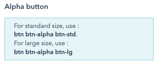
Buttons
Here you'll be able to set custom styles for the buttons used in your website.
You can define styles for three types of buttons:
- Your Alpha Buttons
- Your Beta Buttons
- Your Gamma Buttons
These different types allow you to use a style hierarchy for your buttons. We recommend to use the Alpha style for your primary buttons, the Beta for your secondary buttons and the Gamma as a third option for other types of buttons.
You'll also be able to define the styles of your links here.
For each of them, you can customize:
- the button type: it basically defines the look or your button
- the size variants: standard and large
- the default style and the hover style
Then, choose the transition and animation types you'd like to apply to your buttons.
|
Note:
|
Layout and Spacing
This is where you'll customize the default layout properties and spacing properties, including:
- the background color of your website
- the maximum width of your content and the margins and spacings you want to apply, both on desktop and mobile
- the margins and spacings you want to apply to the columns for your default layout
- the margins and spacings you want to apply to the rows for your default layout
Forms
This section let you adjust the default settings for all the forms in your website. From here, you'll be able to customize all the appearance of your forms, including:
- styles of the form container
- styles of the form title
- styles of the form labels
- styles of the form fields
- the spacing properties
Site Header
You'll find a bunch of options available to customise your site header.
You can choose among these options for your website pages:
- display your header horizontally (pretty traditional) or vertically (yes!).
- use the header with a "classic" position or a sticky position
- display the mobile nav with a standard position (top right) or at the bottom of the screen (classy!)
This is where you can customize your landing pages header too.
Site Footer
In progress
Modules
In progress
Blog
In progress